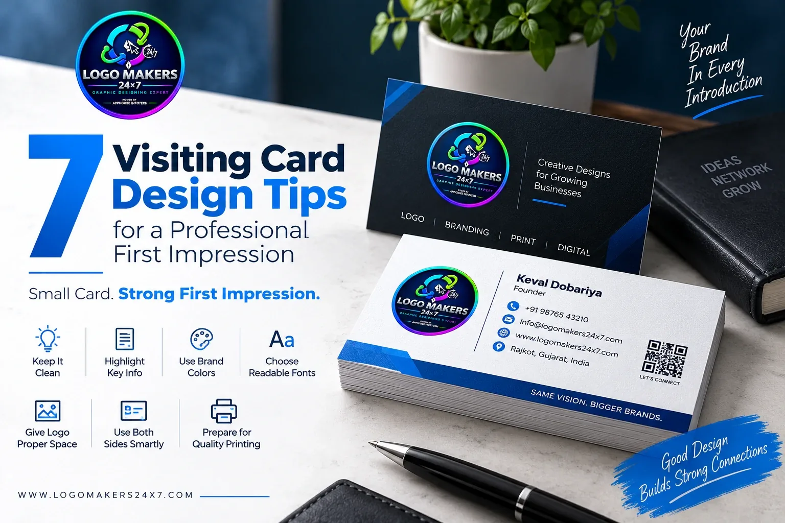
A visiting card may be small, but it can create a strong first impression. A clean and professional card helps people remember your business and makes your brand look more trustworthy.
Here are 7 simple tips for better visiting card design.
1. Keep the Design Clean
Avoid adding too much text or too many elements. A simple layout looks more professional and makes important details easier to read.
2. Highlight Important Information
Your card should clearly show:
- Name
- Business name
- Mobile number
- Website
- Address, if required
3. Use Your Brand Colors
Use the same colors as your logo and brand identity. This creates consistency across your business materials.
4. Choose Easy-to-Read Fonts
Avoid overly decorative fonts for contact details. Use clean typography that remains readable even at a small size.
5. Give Your Logo Proper Space
Your logo should be visible without making the card look crowded. Good spacing helps the design look balanced.
6. Use Both Sides Smartly
The front can focus on the logo and brand, while the back can include contact details, services or a QR code.
7. Prepare the Card for Printing
A professional visiting card should be created in the correct size and high-quality print format so text, colors and graphics remain sharp.
Make Your Visiting Card Match Your Brand
A good visiting card should be:
- Simple
- Professional
- Easy to read
- Consistent with your branding
- Ready for quality printing
At Logo Makers 24x7, we create professional visiting card designs that match your logo and complete brand identity.