Color is one of the most important parts of a logo. The right color can make your brand look professional, memorable and suitable for your target audience.
Different colors create different feelings, so choosing the right combination matters.
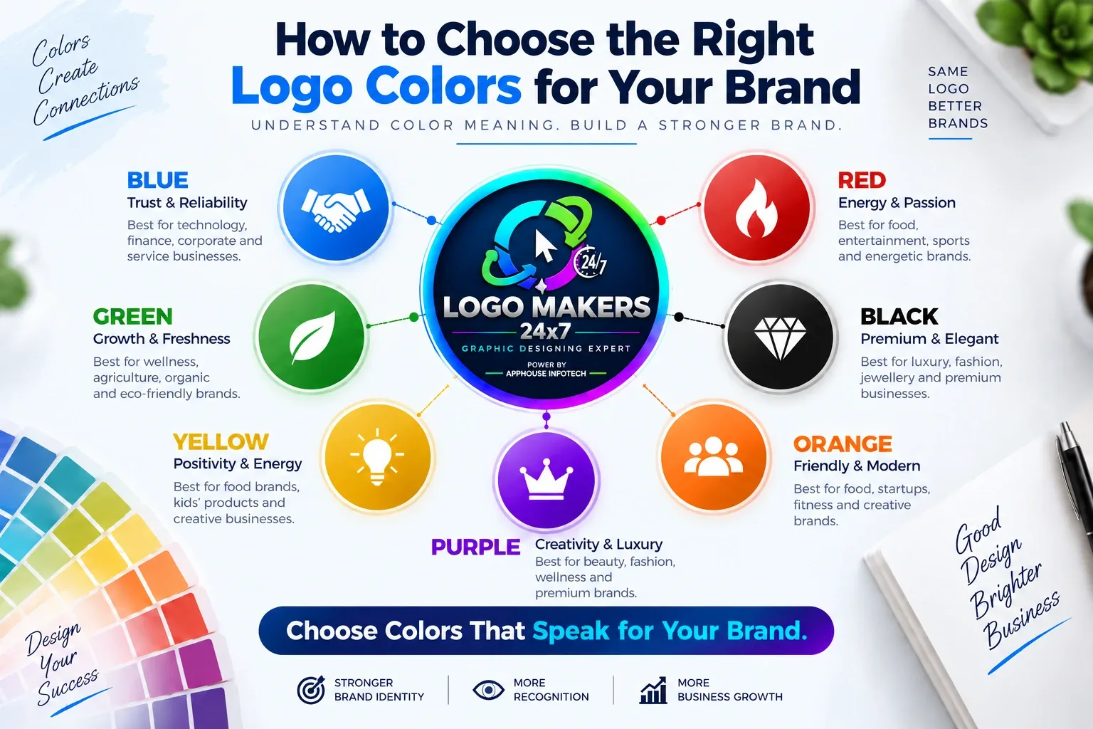
Blue
Blue often represents trust, professionalism and reliability.
Best for:
Technology, finance, corporate and service businesses.
Red
Red is bold, energetic and attention-grabbing.
Best for:
Food, entertainment, sports and energetic brands.
Green
Green is connected with nature, health, freshness and growth.
Best for:
Wellness, agriculture, organic and eco-friendly brands.
Black
Black creates a premium, strong and elegant look.
Best for:
Luxury, fashion, jewellery and premium businesses.
Yellow
Yellow feels positive, friendly and energetic.
Best for:
Food brands, kids' products and creative businesses.
Purple
Purple can represent creativity, luxury and uniqueness.
Best for:
Beauty, fashion, wellness and premium brands.
Orange
Orange looks energetic, modern and friendly.
Best for:
Food, startups, fitness and creative brands.
How Many Colors Should a Logo Have?
For most businesses, 1 to 3 main colors are enough.
Using too many colors can make a logo look busy and difficult to use.
Choose Colors That Match Your Brand
Before selecting colors, think about:
- Your industry
- Target audience
- Brand personality
- Competitors
- Where the logo will be used
Your logo colors should look good on both digital and print platforms.
Keep It Simple and Consistent
A strong logo color palette should be:
- Easy to recognise
- Consistent across branding
- Clear on light and dark backgrounds
- Suitable for social media and printing
At Logo Makers 24x7, we create professional logo designs with color combinations that match your business and brand identity.
Explore Our Logo Design Services
View Our Portfolio
Start Your Logo Project